WAT-E2090 - Water and People in a Changing World D, Lecture, 25.10.2022-1.12.2022
This course space end date is set to 01.12.2022 Search Courses: WAT-E2090
Topic outline
-
Overall guides for different visualisation types
- Fundamentals of data visualisation: http://serialmentor.com/dataviz/ (very good online guide to the basics of good, informative and visually appealing visualisations)
- Visualisation quick guide: https://www.domo.com/assets/downloads/resources/visualization-guide.pdf (guide to select right kind of visualisation and most important things to consider in those)
- Data visualisation catalogue: https://datavizcatalogue.com (great catalogue of the different visualisation types, good examples, inspirations)
Some tips for good poster design
- https://blogs.lse.ac.uk/impactofsocialsciences/2018/05/11/how-to-design-an-award-winning-conference-poster/
- http://www.planetary.org/blogs/guest-blogs/design-sci-poster.html
Specific guides
Week 1: Maps
Week 2: Bar graphs & Scatter plots
Week 3: Histograms and tables
- Histograms
- Tables:
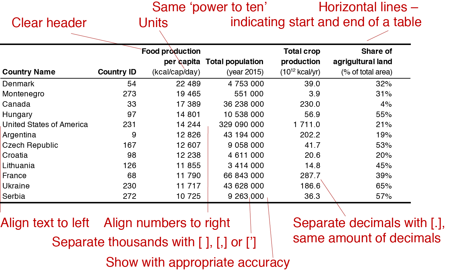
Table 1. Example table from the week's exercise, with the most important characteristics of the table highlighted. Table shows the countries with per capita food production larger than 10 000 kcal/cap/day.

Week 4: Vector maps and 100% stack bar
Week 5: Stacked area graph or trajectory plot
Week 5&6: Infographics
- Water related infographics
- Guides for good infographic: Venngage blog
- Fundamentals of data visualisation: http://serialmentor.com/dataviz/ (very good online guide to the basics of good, informative and visually appealing visualisations)
